
Figure 1 Part of the ribbon when the chart is selected is shown.

Excel will fit a curve to data and give a mathematical expression for the curve. This process is called regression. The curve is called a trendline. Regression allows us to determine model parameters associated with the process represented by the data. For example if we are measuring the force need to stretch a spring, the linear model used to describe the spring is Hick's law,
F = k xwhere F is the force, x is the amount the spring has stretched, and k is Hook's constant for the spring.
Excel will take the force and displacement data, fit it to a curve, and give us the equation which includes the constant, k.
k is a model parameter. It describes the spring.
A more precise model might include a higher order polynomial rather than the simple linear function given by Hook's law. But more complex models are harder to work with. The rule is to use the simplist model that will give the required accuracy. All models are approximate to some degree.
Fit a curve to data
The first step is to creat a chart containing the data. Then, select the chart. Notice that when the chart is selected, the ribbon contains the Trendline button as shown in Figure 1.
Figure 1 Part of the ribbon when the chart is selected is shown.
Click on Trendline and select More Trendline Options. The folowing form comes up.
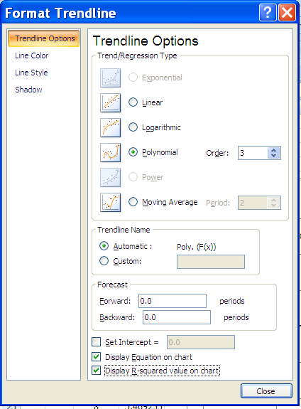
Figure 2 The trendline options form is shown. Notice, polynomial order 3 is selected.
And "Display Equation on chart" and "Display R-squared value" are checked
Figure 3 shows the spread sheet and the resulting chart.
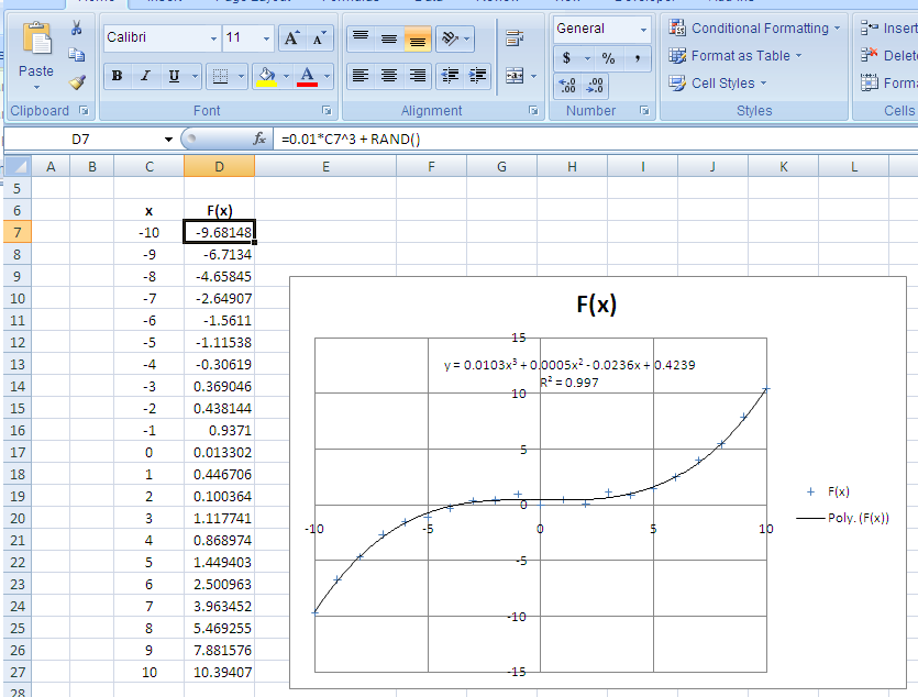
Figure 3 The Excel sheet containing the chart with the trendline is show. Data was plotted as unconnected crosses.
The line is the trendline.
The data was generated using the expression,
= 0.01*C7^3 + RAND()This expression is shown in the formula bar. It results in the value displayed in cell D7. F(x) is x3 plus a random number from 0 to 1. This approximates an experiment where F(x) would be perhaps measured data that contains some error.
As shown on the chart, the formula for the trendline is,
y = 0.0103 x3 + 0.0005 x2 - 0.0215 x + 0.4239If the random number had not been added in; y would equal 0.01x3.
R Squared
The R-Squared value shown on the chart is a measure of the fit of the curve to the data. A perfect fit results in an R-Squared value of one. R-Square equals 1 minus the ratio of the mean squared error divided by the average of the squares of the difference between the curve points and their average.
where yi is a curve point corresponding to the data point xi and y bar is the average value of the yi. In a perfect fit, yi will equal xi and R - squared is one.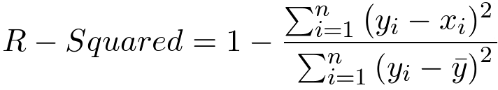
The R-squared value shown of 0.997 indicates a good fit to the data as can be seen in the chart.
There is additional information on the use of Excel in extracting model parameters from data in the tutorial on formulas and plotting.