

Plotting Data in Excel Measured data as well as simulated data can be plotted on the same chart using excel. Select the columns to be plotted (measured as well as simulated). In the tools pulldown menu select;
tools>Options>chart>Plot empty cells as interpolated.
This makes the measured points visible by drawing lines between the few points.
Now that the measured data is visible, it can be selected. To show data point markers, right click on the measured data trace > Format Data Series > Marker >Custom.
Choose a marker to make data points visible.
In the plot shown below, once the measured data trace was visible it was
tools > options > chart > not plotted (leave gaps)This will result in the data points being represented only by markers.
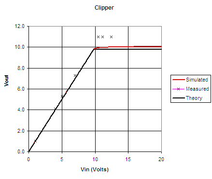
The theory calls for the output voltage to equal the input as long as the output is less than 9.8 volts. If the input is greater than 9.8V the output equals 9.8V. This is achieved in excel using the formula;
=IF(C11<9.8,C11,9.8)This formula was entered into the cell F11. Column F was set up to contain theoretical values. Column C contains Vin. The if statment says if Vin < 9.8 then F11 equals Vin. Otherwise it equals 9.8. i.e. F11= if(c11 < 9.8 is true, C11, else 9.8)